Let’s delve into the fascinating world of color theory with a focus on the color blue.
Blue is often associated with calmness, tranquility, and stability. In color theory, it is considered a “cool” color, as opposed to warm colors like red and yellow. Blue is known to have a calming effect on the mind and body, which is why it is often used in bedrooms and relaxation spaces.
Blue is also a versatile color that can evoke different emotions depending on its shade and context. Lighter shades of blue, such as sky blue or baby blue, are often associated with feelings of serenity and freshness. Darker shades, like navy blue, can convey a sense of elegance and sophistication. In design and art, blue is used strategically to create various effects.
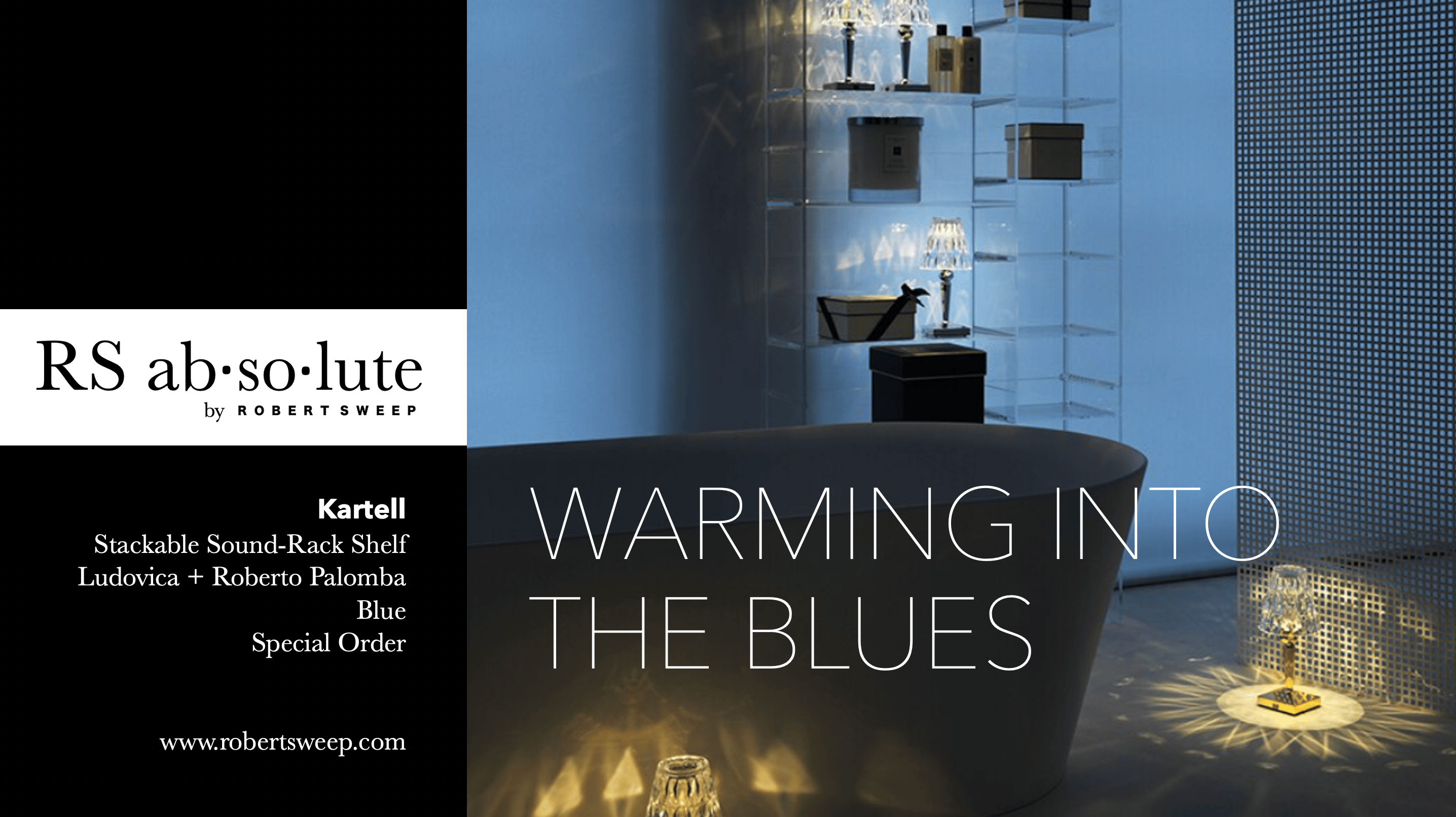
Working with blue in our homes can often be challenging, especially in our winter climate. Blue can be cooling and fresh, but in a winter season we crave for warmth in our homes.
One of our key strengths at Robert Sweep Homefurnishings is our knowledge and use of color in our showroom and our interior design projects. Here we would like to focus our discussion on how design professionals use blue within both our homes and commercial spaces of business.
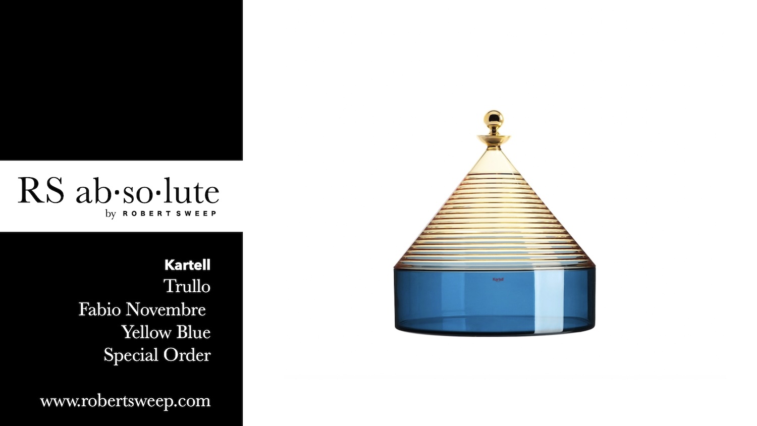
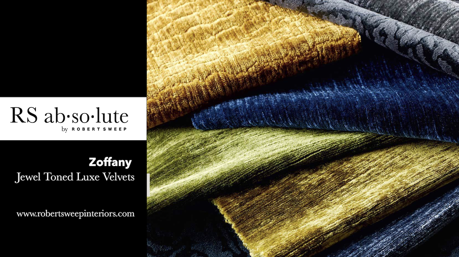
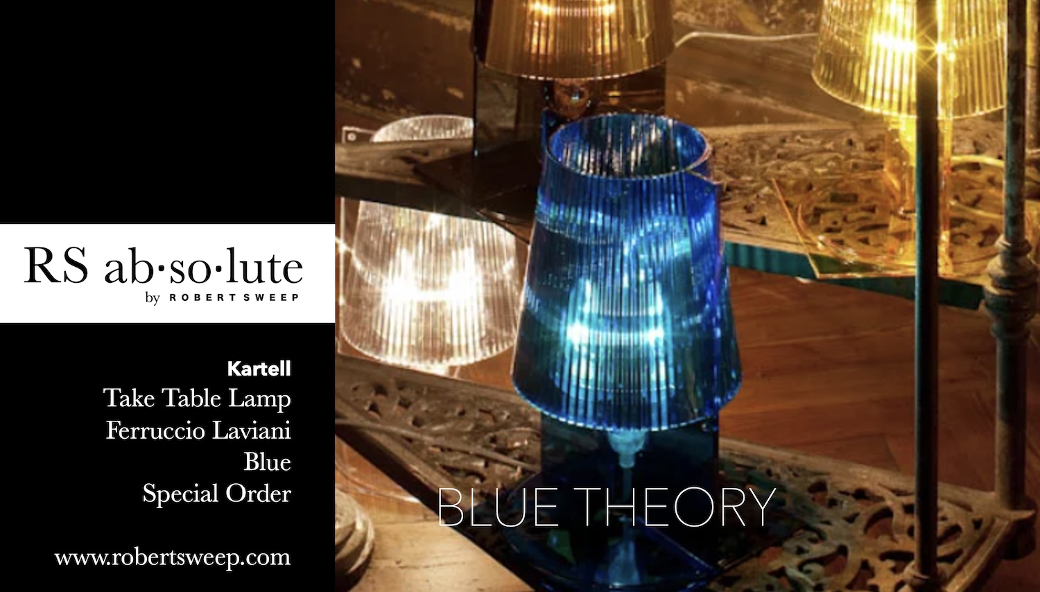
When it comes to color theory, the combination of blue and yellow is known as a complementary color scheme. Complementary colors are those that are opposite each other on the color wheel. In this case, blue and yellow are opposite, creating a high-contrast and visually striking combination.
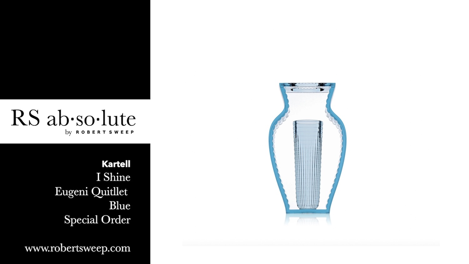
The reason blue and yellow work well together is due to their inherent contrast. Blue is a cool color, while yellow is a warm color. The contrast between cool and warm creates visual interest and can elicit a sense of balance in a composition. This combination often creates a vibrant and dynamic visual experience. Furthermore, blue and yellow are also considered to be visually pleasing because they have a high degree of contrast in terms of lightness.
Blue is generally not the most suitable choice for retailers’ window displays or marketing campaigns when the goal is to create excitement or grab attention.
Blue, being a calm and soothing color, may not evoke the sense of urgency or impulse that retailers often seek to generate. Bright, bold, and energetic colors like red, orange, or yellow are commonly used in retail to create a sense of excitement, enthusiasm, and impulse buying.
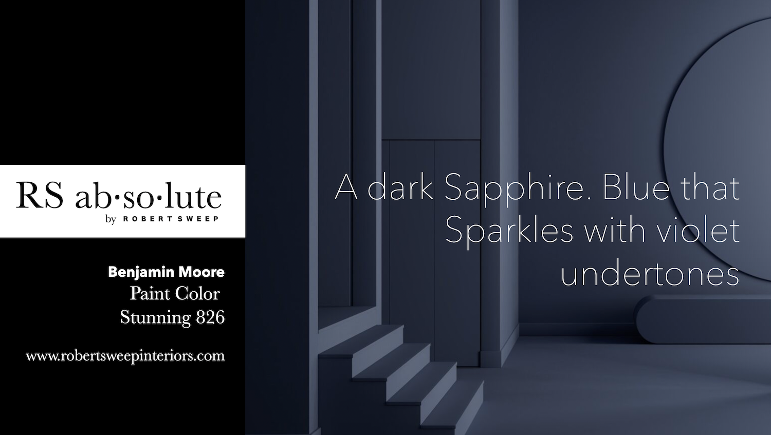
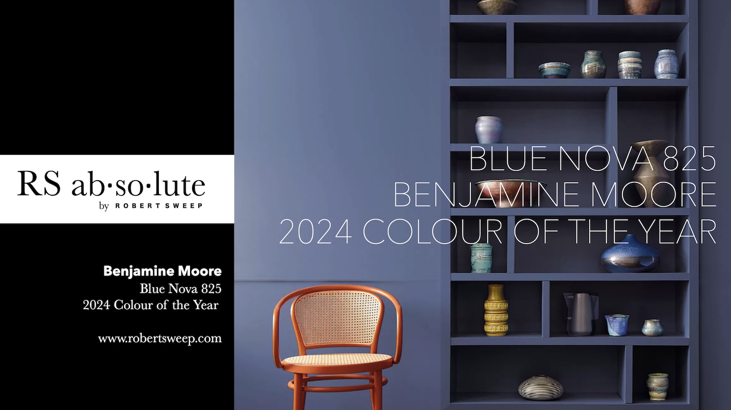
Observe Benjamin Moore
Paint Colour-of-the-Year 2024,
Blue Nova 825,
a hue of blue and violet that sumptuously comes together in this elevated colour.
Marketing this calming color on its own is difficult to convey excitement without the use of the power-house color of excitement that orange will convey to buyers.
This contrast expresses excitement, adventure and creativity in the realm of calm and expansiveness.
A perfect colour of our time.
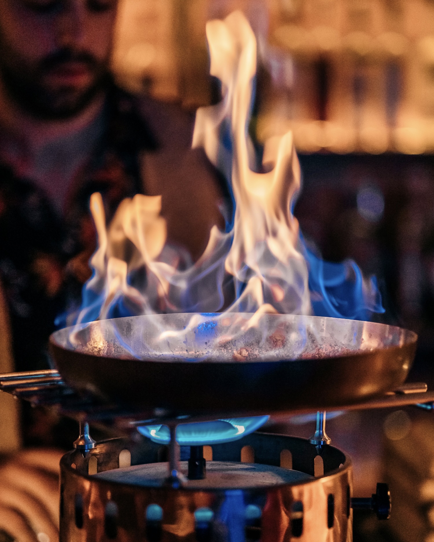
Photo Credit: Andrea Mosti
Nature knows best!
Here we see the blue flame of a gas cook stove and we see how nature has the perfect answer for making the blue tone feel warm.
How intriguing the fact that the blue flame is higher in temperature than the golden flame, opposite to how we visually see it.
The distinct blue and yellow colors of the candle flame result from different stages of combustion and temperature variations within the flame.
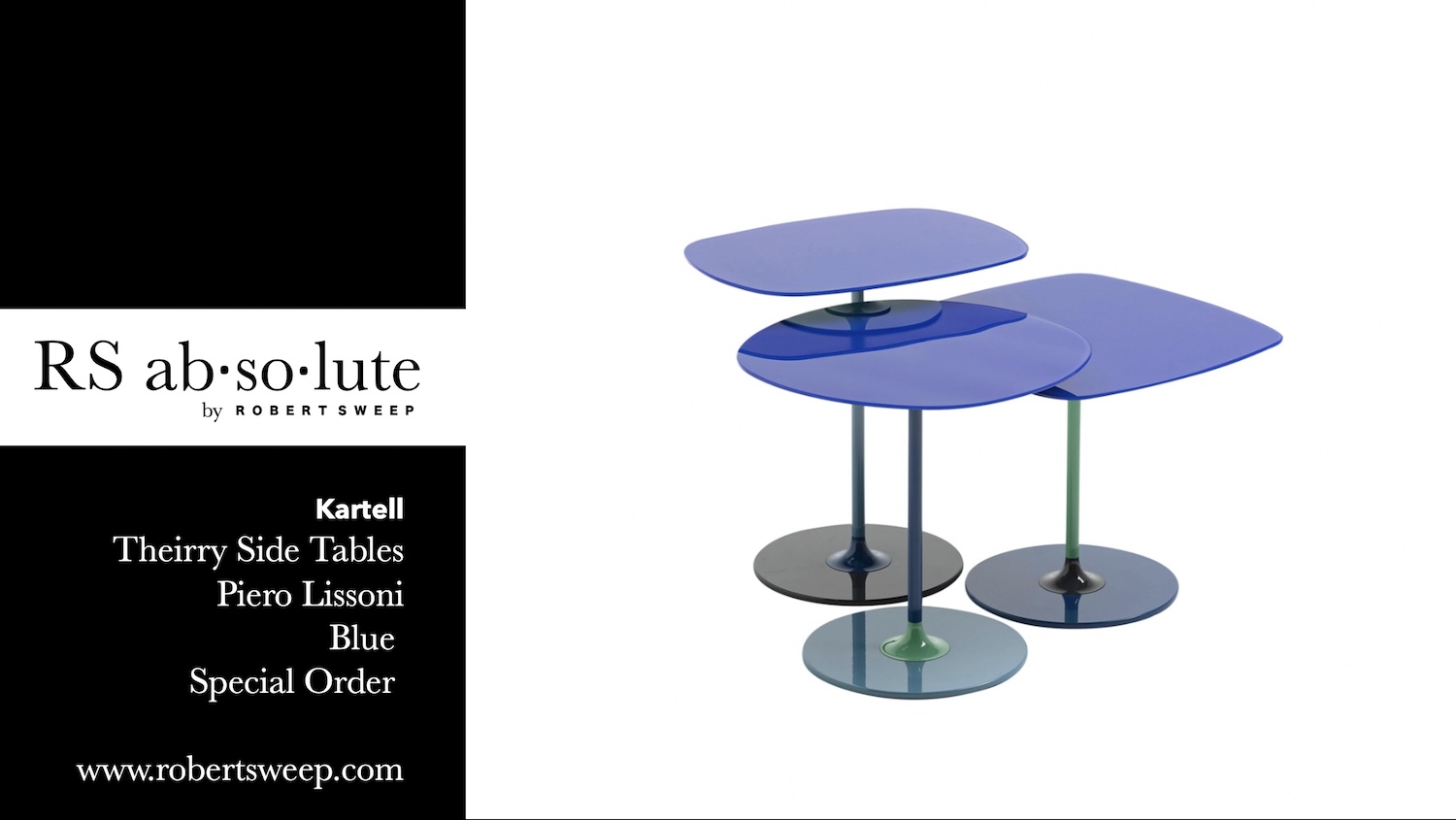
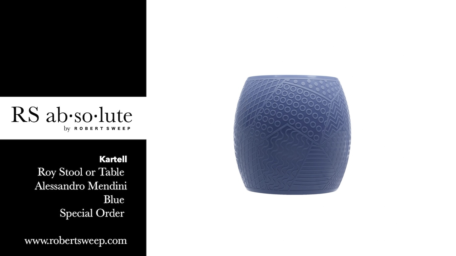
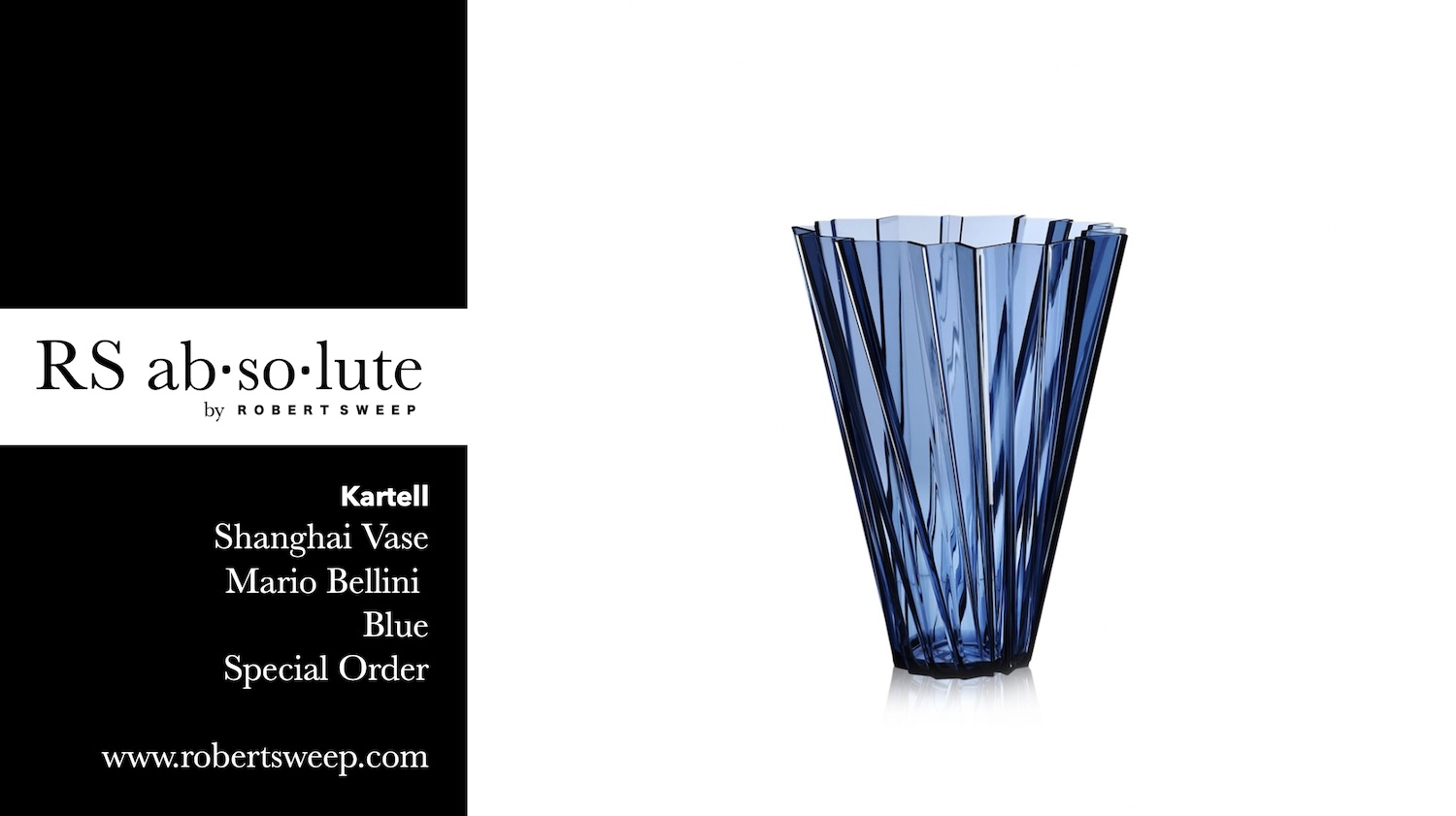
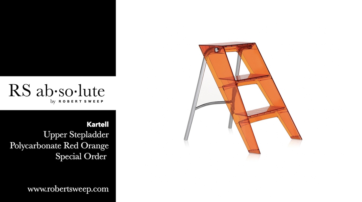
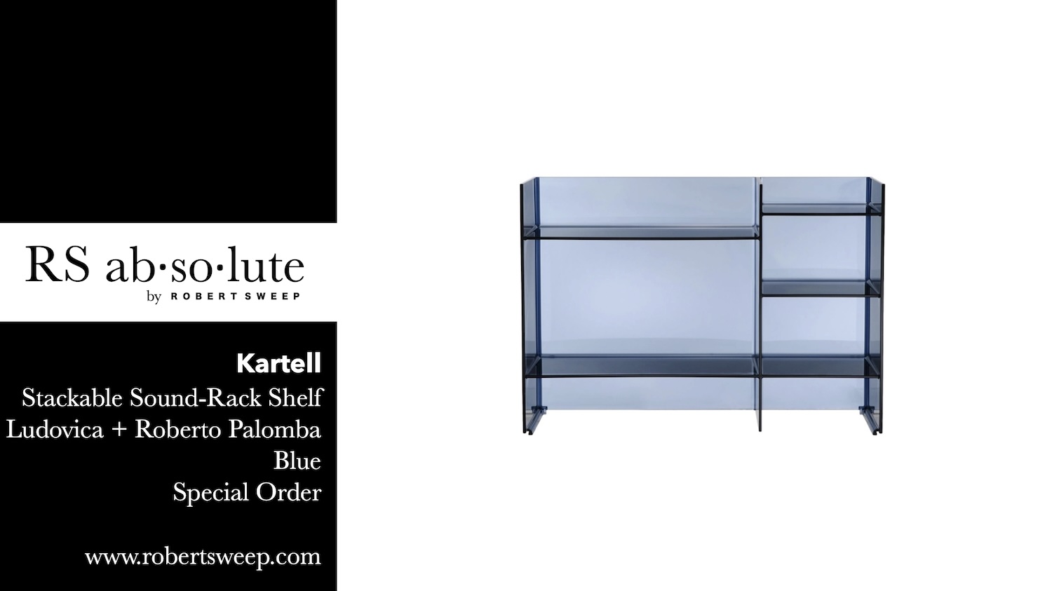
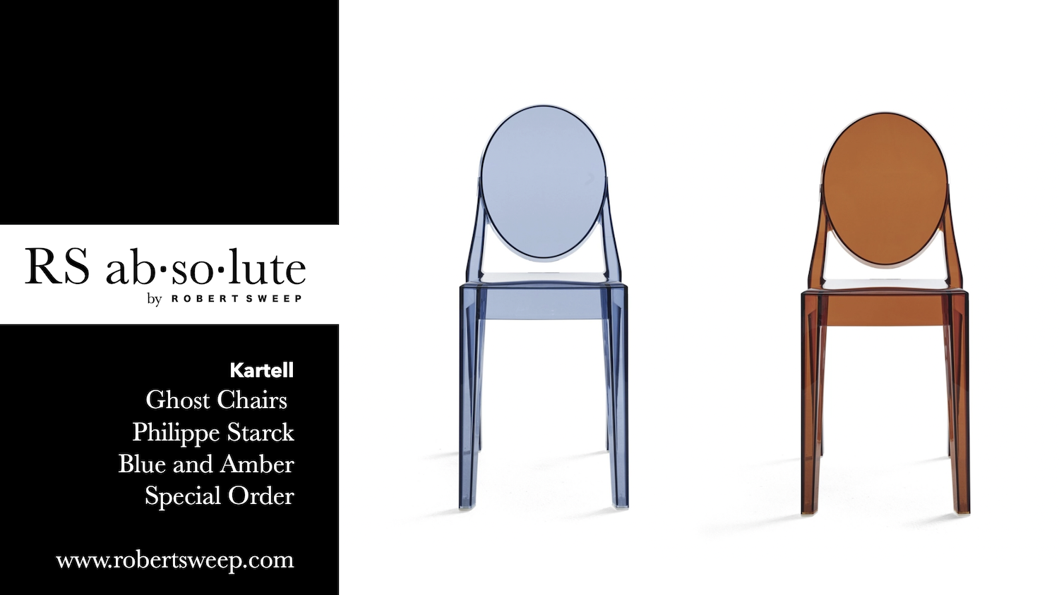
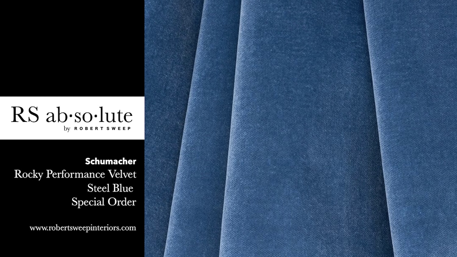
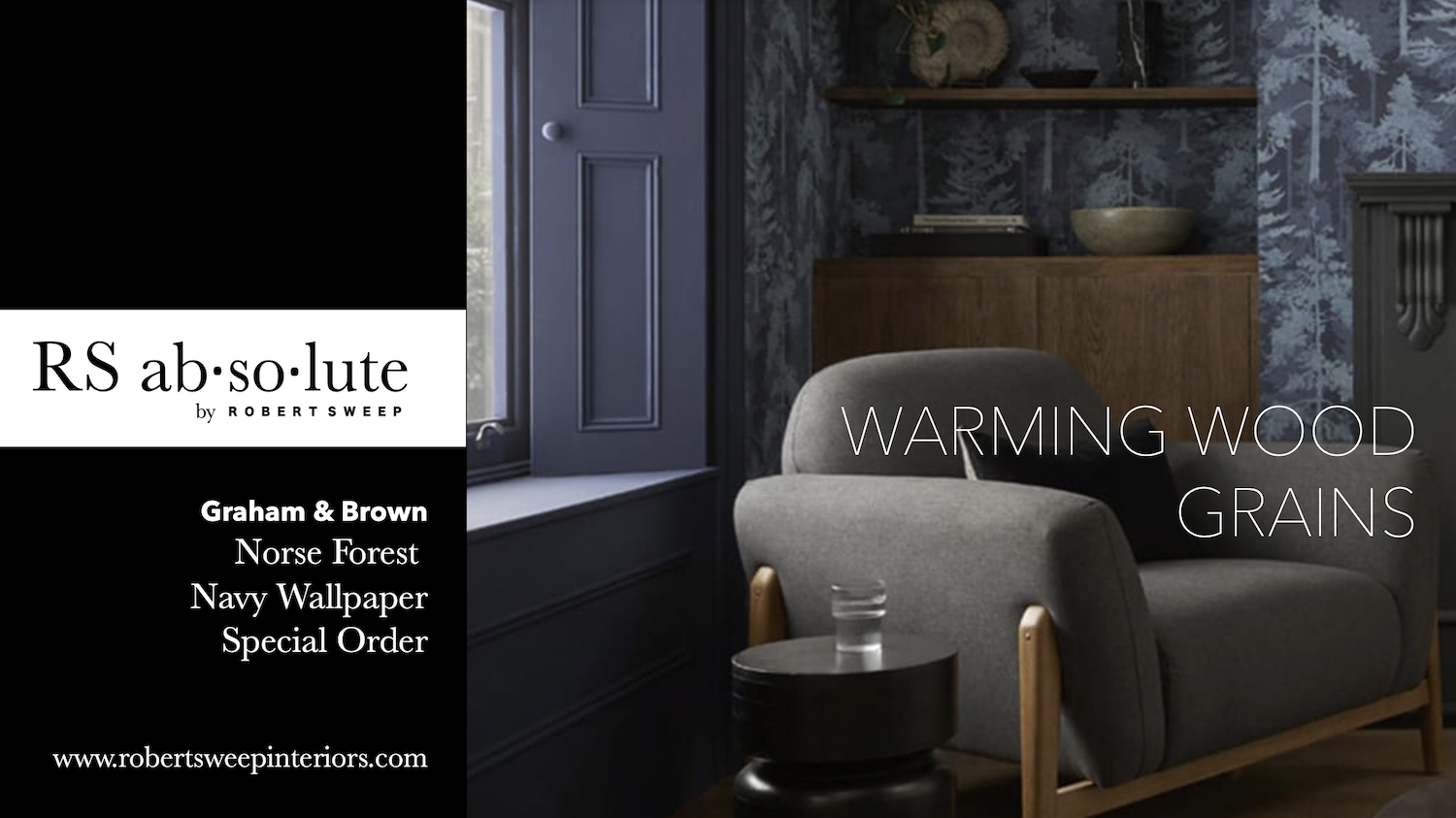
Our favorite blue color for walls is navy blue.
This deep rich colour is commonly associated with professionalism, trustworthiness, and reliability, which makes it a popular choice for clothing for many business professionals. The deep and rich tone of navy blue exudes a sense of authority and credibility, which aligns well with the values and expectations of professionals.
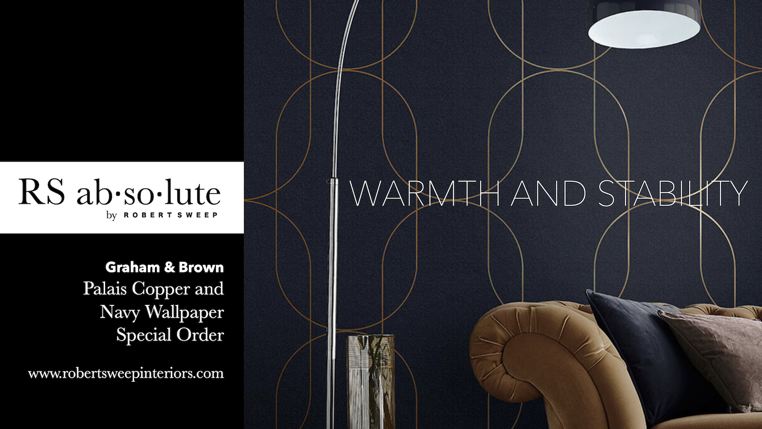
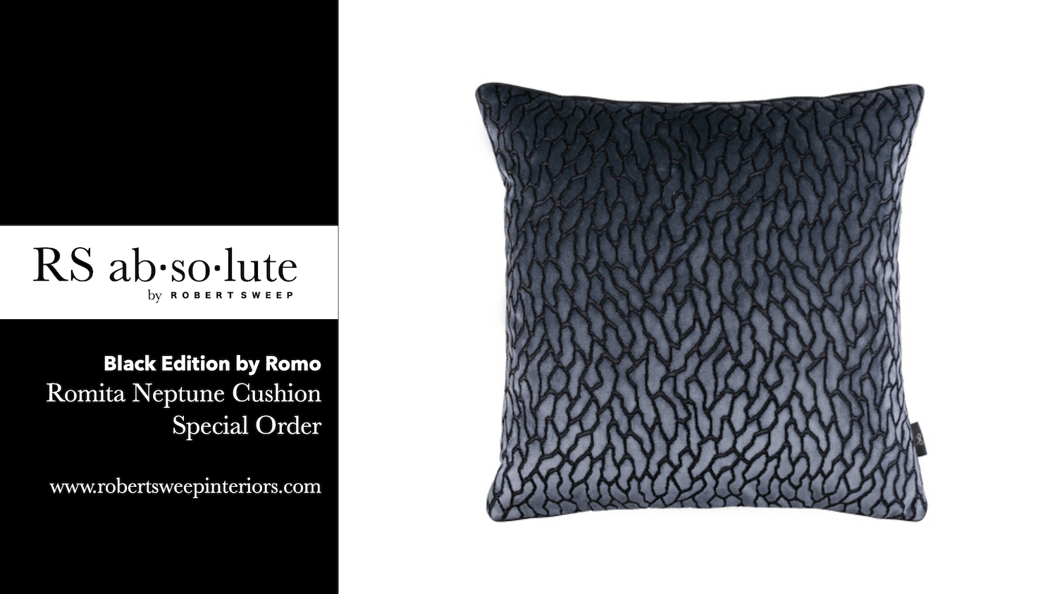
Our recommendation at ROBERT SWEEP INTERIOR DESIGN for the best way to use the colour navy within your home, is to bathe your walls in the rich hues of navy paint or a classic wallpaper. Use a high contrast colour either in yellow golds or whites in soft upholstered seating along with the addition of ambient lighting. These details will play a vital role adding a glow of warmth within your room of blue.
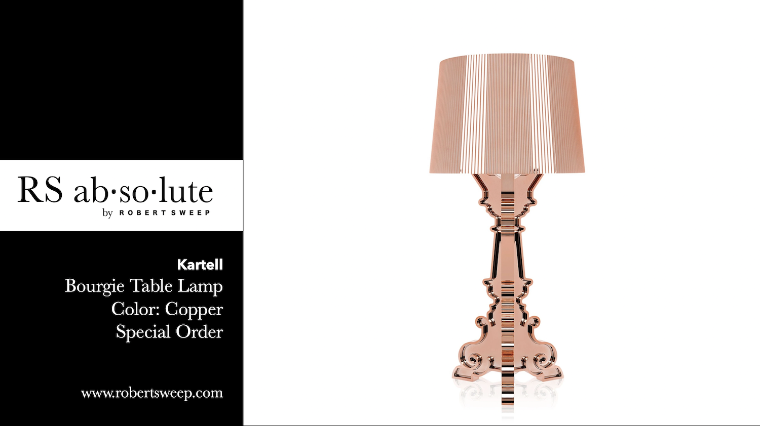
Coppery tones of rose gold and navy is a great choice to work together as high contrasts and complimentary tones. This combination is sophisticated and exudes luxury in a very stable and understated way.
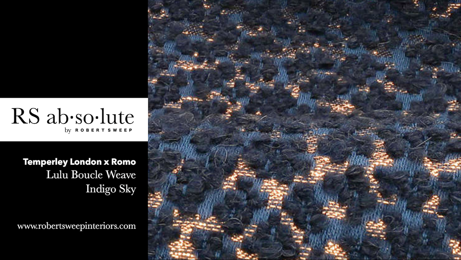
Blue and white
is another color combination that creates a visually striking and high-contrast effect. The deep blue against the bright white creates a strong contrast in both hue and value.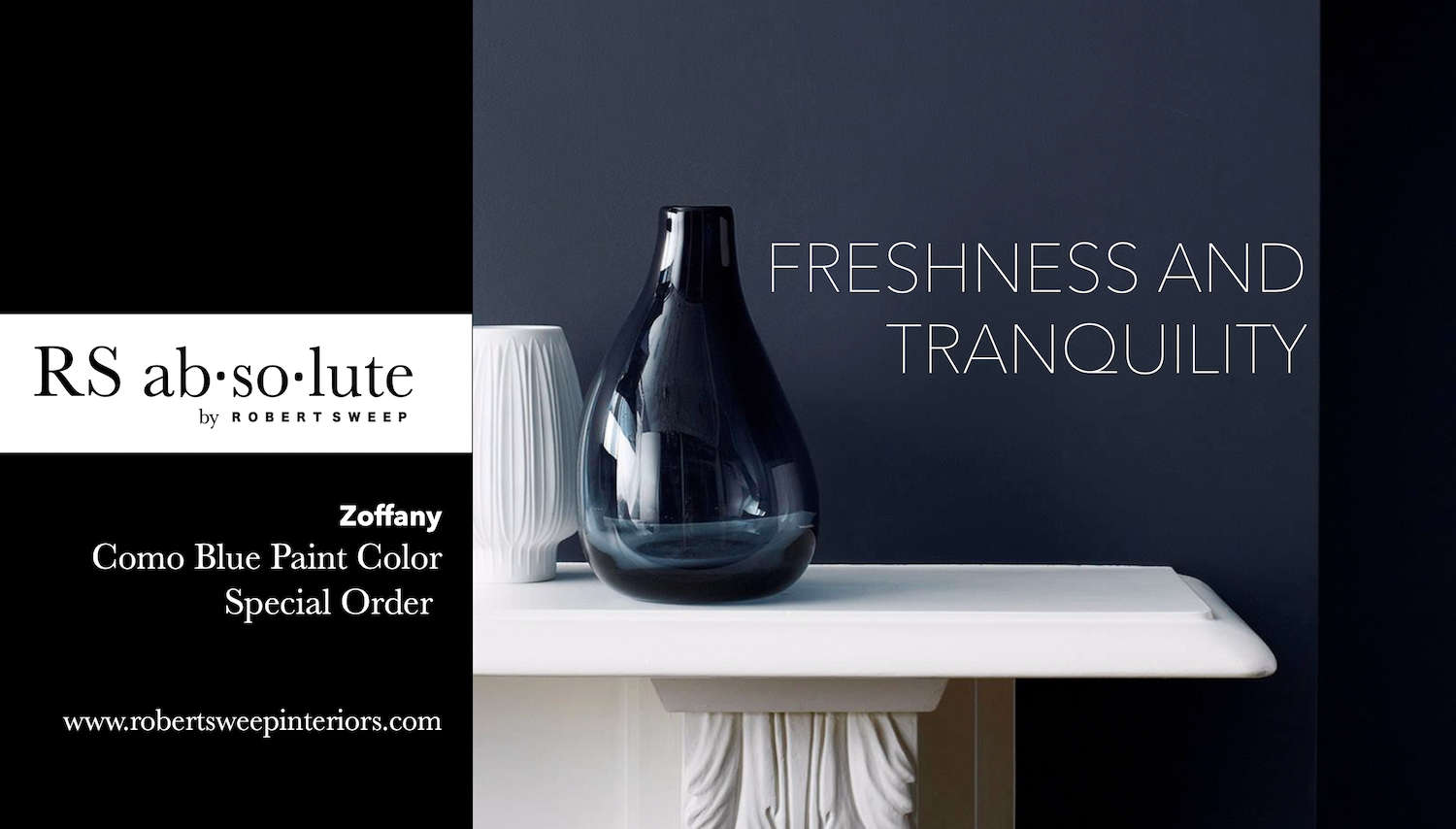
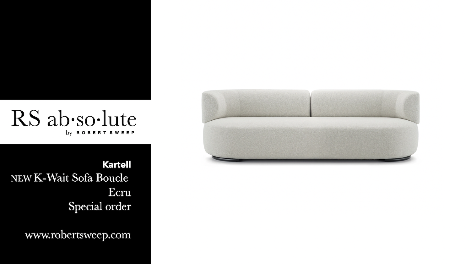
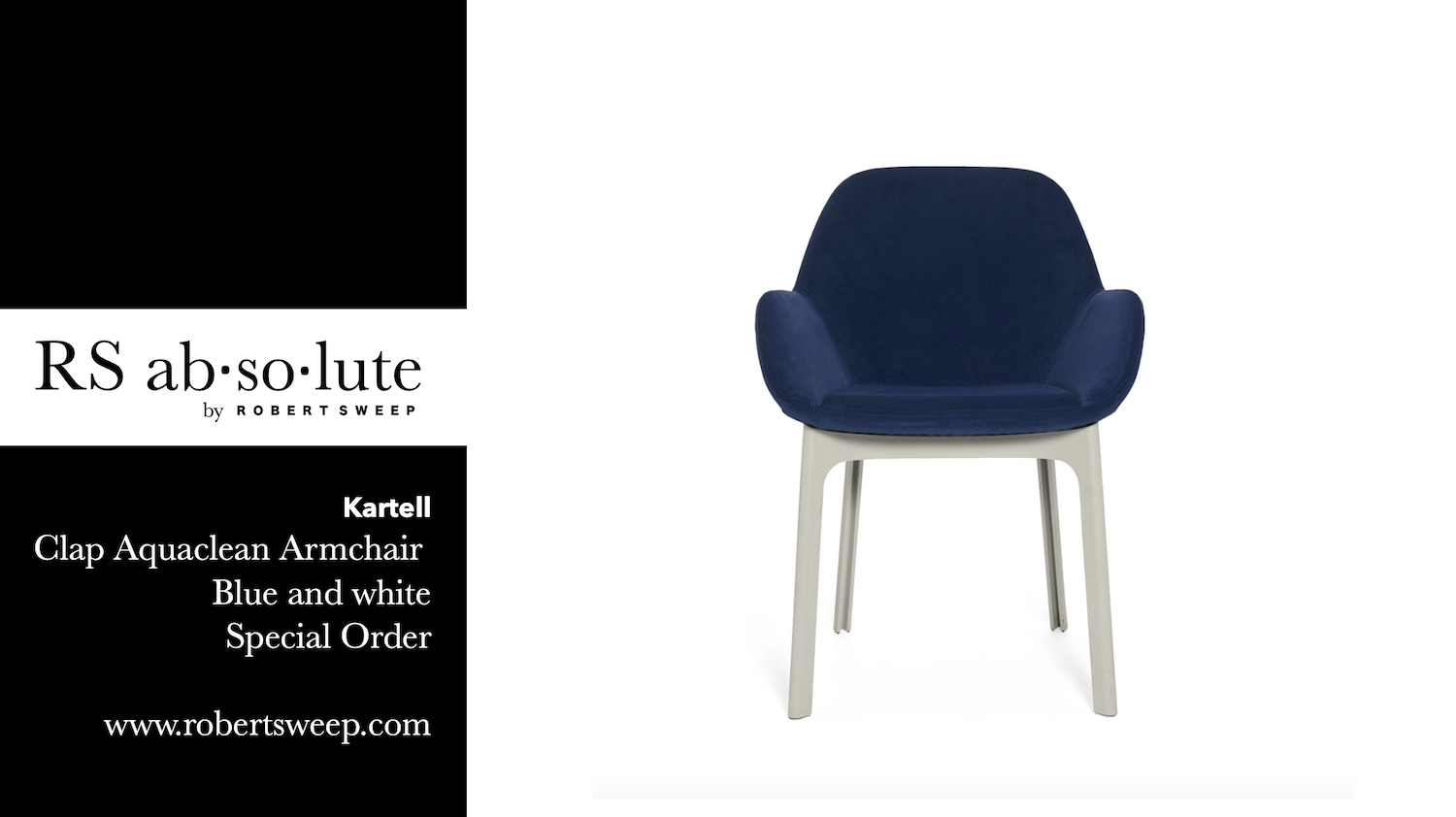
Blue and white combinations can evoke a sense of freshness, cleanliness, and tranquility. This combination is often associated with nautical themes or used in beach-inspired designs, as it can evoke a feeling of being near the ocean or the sky. Additionally, blue and white is a popular choice for representing purity and simplicity in various design contexts, such as interior design, graphic design, and fashion.
NATURAL WOOD GRAINS
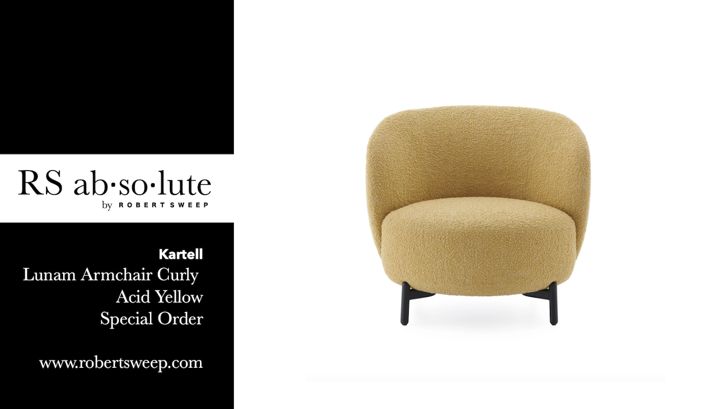
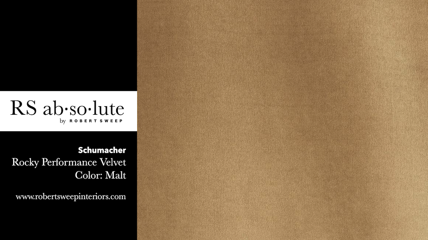
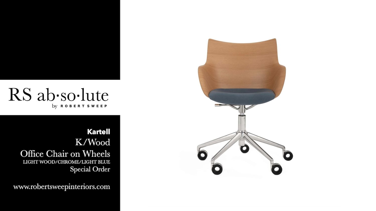
Adding the natural element of wood will add warmth to your room with the inviting colors and visual grain of wood. Natural wood with warm golden tones is always a successful compliment to contrast the cooling tones of blue.
Remembering these tips of contrasts will always bring success in your interior space using blue as a base color.
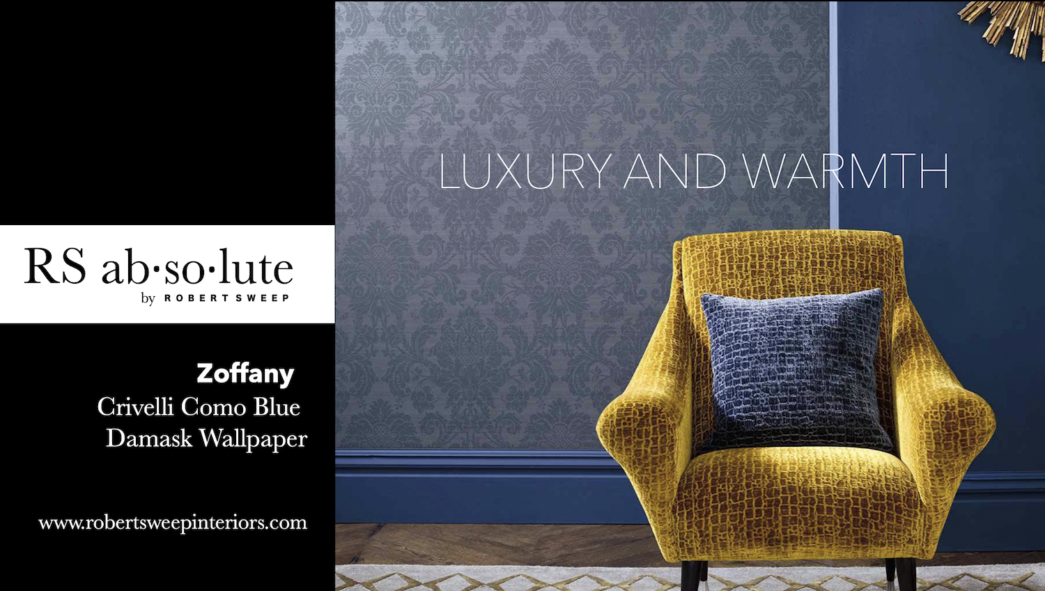
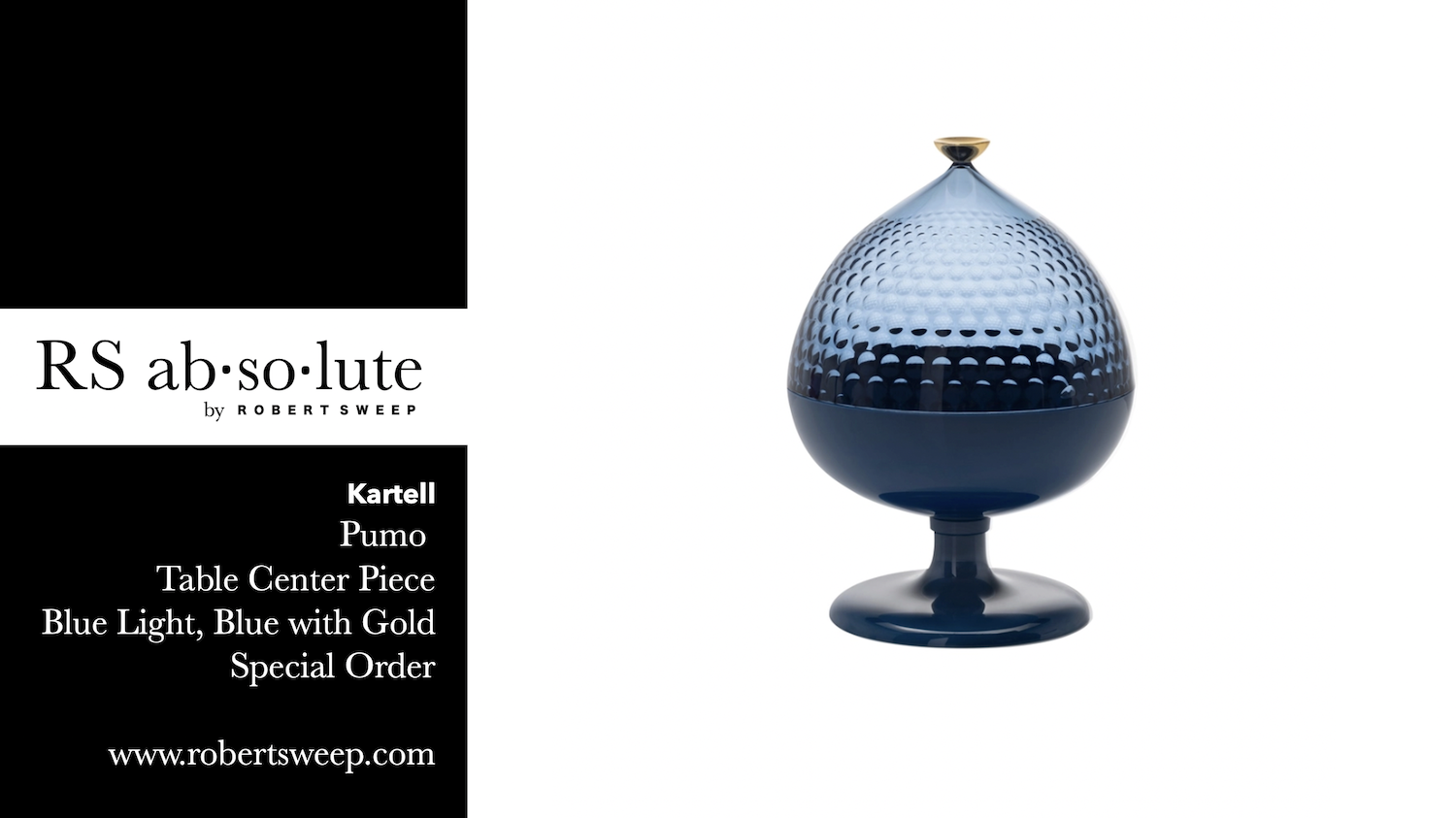
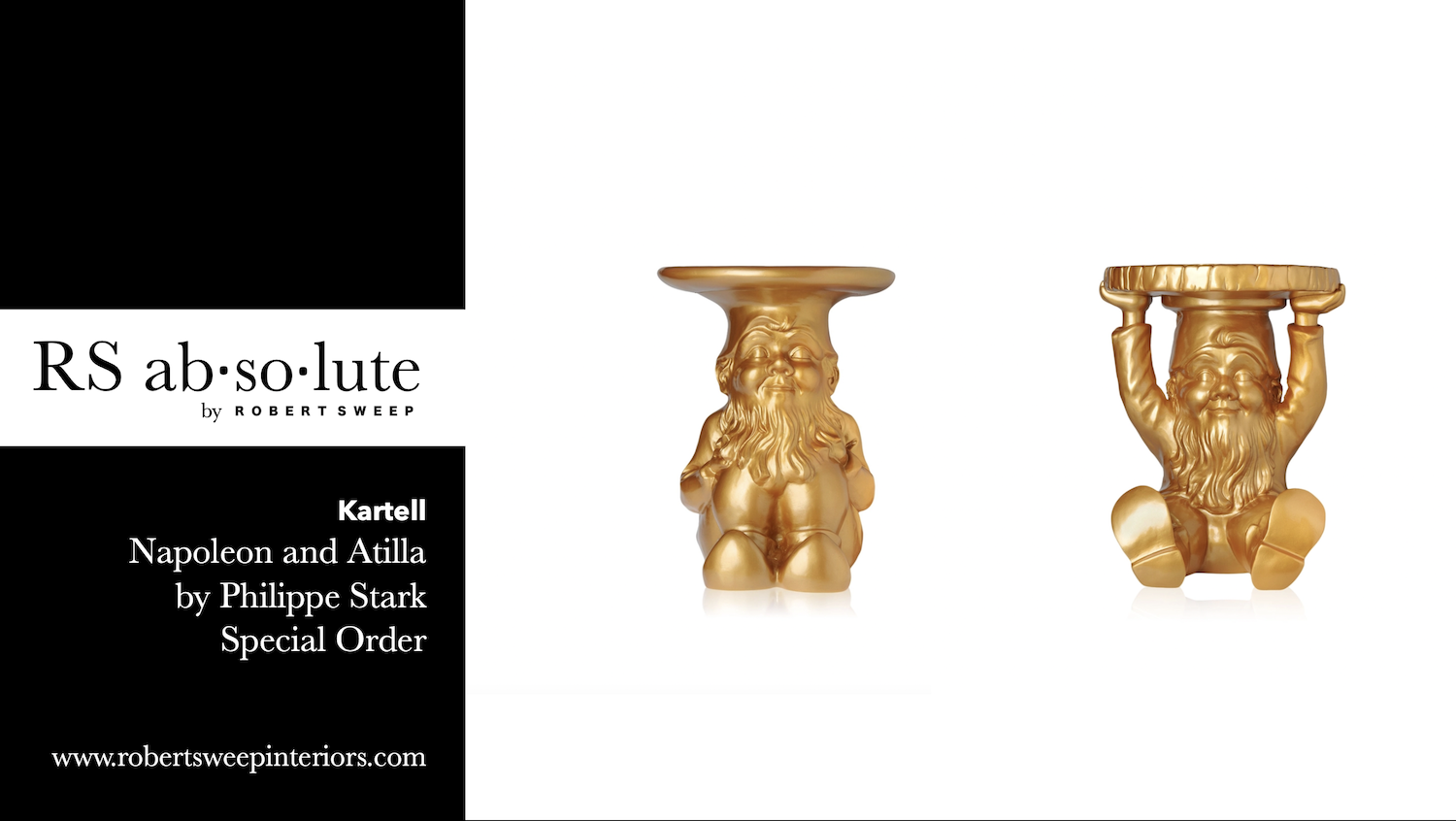
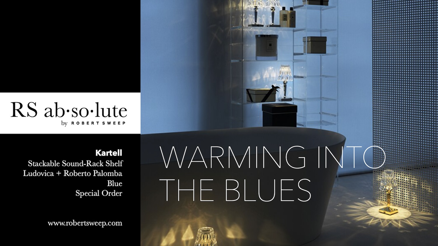
We can warm into the “Blues” by adding the touch of gold.
